April 2008
My iTunes: Beautiful Mystery by Telecast
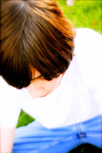
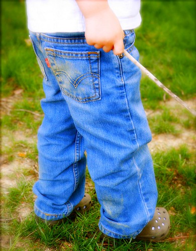
Here is a couple more from another recent shoot. I have said before that I love siblings. Trying to capture an intimate connection is always what I strive for in this situation. These two brothers are eight years apart. You can see the difference in years in these two shots.
I just really like these.
Have a great week everyone!
Little Brother
April 2008
April 2008


23 comments:
Love them! You really can see the age differences, and I like how you chose to capture each brother -- I don't think you could switch the composition and framing and achieve the same effect...
Yes, I am up late... I have my opera workshop performance tonight and am still excited from that. I'm hitting the sack soon, though! And yes, my brother has quite the eye as well. I think his chosen blogger identity is sweet = )
These are really good, Anna. I love reading the little bit you write about your pictures as well. I may have mentioned before that I love to hear the reflection of the photographer on the image(s).
Assuming you won't mind, I'm adding you to my sidebar under my favorite blogs.
These are great! The size is magnified by the angle and tightness of the shots. They make quite a contrast.
Great shots Anna! How cute are those little crocs shoes?
There arenealry ten year sbetween myself and my youngest sister and I think these pictures show this kind of age gap wonderfully :)
Anna: Cute pictures of the boys.
I have to comment on your clothesline. Every time I visit it just pops into view. It is truly unbelievable. I stand in awe of the photo.
(If I could look at what I type I wouldn't have to delete. Sorry.)
I have noticed that sometimes you use Flickr, and sometimes you don't. On days that you do, I have to wait until I get back home to see the pics.
Oh, well. The needs of the many, and whatnot.
I love the last one! They should use it for a Levis ad.
Those are great shots. Like Karen said, it does look like a Levi's ad. Job well done.
Oh wow, they're both stunning! And I love the effect you used on the photos too.
Just wonderful, both.
Great color in those ... makes the jeans really pop.
Great post as usual Anna. there is 6 years between my boys and I have watched this age difference for almost 10 years now.. It is amazing how much they have in common that I don't see until I go back and look at the photos from when my oldest was the same age as the youngest..
My new header is the photo that I tried, and tried SO hard to get for your project Yellow...I guess better late than never... Just wanted to share it with you anyhow.. thanks ~Stacey
I like the photos, especially what you've done with the color, but I'm left wondering if there's some other denim part of the first boy you could have featured besides his crotch.
Anna, you capture so much personality in such simple shots. Love what you did.
I can only imagine what you would do with my 3 boys... Love these pictures of siblings Anna! Oh, and the pegs on top are awesome!
The color on these are incredible... and that is not to mention how creative the composition is... wonderful!
Bad grammar on the last comment... sorry!
After stumbling over Mark's comment I had to go back and look! How funny (especially since I didn't "notice" when I saw the shot initially).
It is so difficult for me to photograph PEOPLE! I've always gone for the "standard" portrait angle, but seeing your perspective is helpful in stepping out of that box.
I'm sure the parents of these guys loved the end result!
:)
Okay, my wife looked at the pictures and said she doesn't see a "crotch shot." She sees a hair shot. After a second look and seeing how much the denim part is blurred and how sharp the hair is, I see her point.
Love the combination of rich colours and the high key whites.
Post a Comment